Item Types
This section describes types of items that can be set in report forms.
Setting items differ depending on the input type.
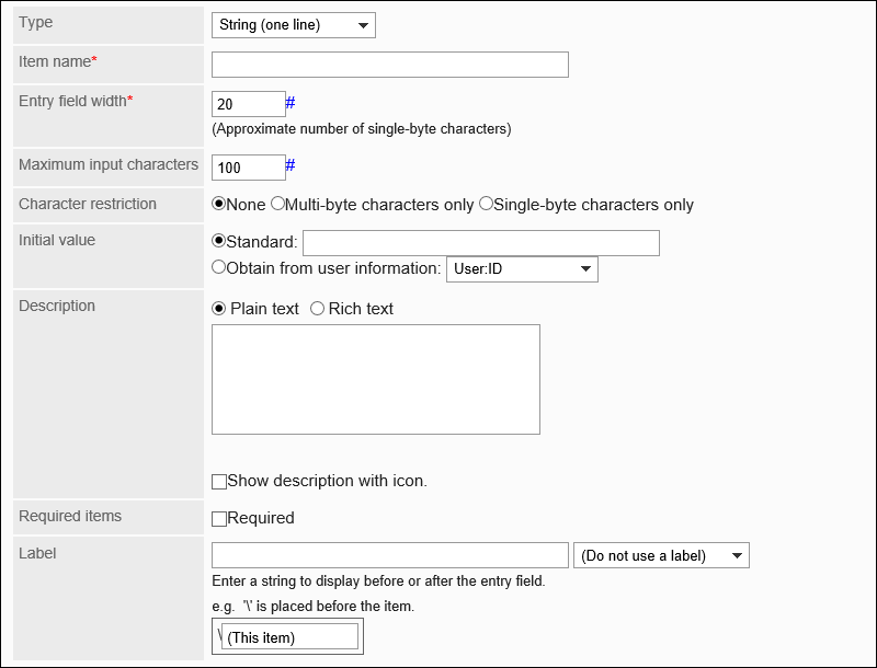
String (One Line)
String (one line) is an entry for text in one line. You cannot enter line breaks in it.

The setting fields are as follows:
| Item | Description |
|---|---|
| Item name | Enter an item name. |
| Input width | Enter the number of characters in single-byte. The number in this field indicates the approximate number of characters. The maximum number of characters can be entered in one line varies depending on the Web browser and characters you enter. |
| Maximum number of characters | Enter the maximum number of characters that can be entered. There is no distinction between double-byte characters and single-byte characters. |
| Limits | You can limit the characters to be entered in double-byte or single-byte only. |
| Default value: | Set the default value to one of the following:
|
| Description | Enter a description of the item. You can use Rich Text Formatting. To display the description on a separate screen, select the "show description with icon" checkbox.  |
| Required Field | Set whether to make the field mandatory. |
| Characters before or after the input field | Added text can be displayed before or after the input field. Enter a string to set the position to display.  |
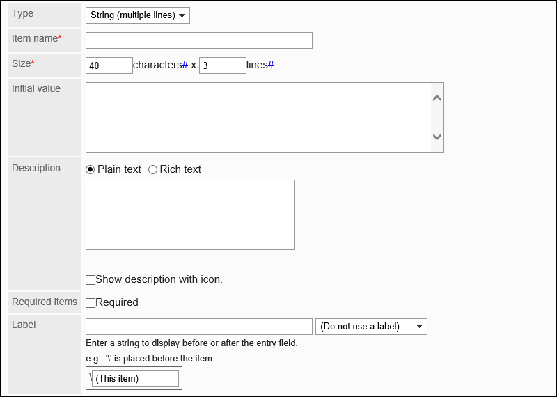
String (Multiple Lines)
String (multiple lines) is an entry for a long sentence in multiple lines.
You can enter line breaks in it.
The setting fields are as follows:
| Item | Description |
|---|---|
| Item name | Enter an item name. |
| Size | Specify the number of digits (width) and rows (height) of the input field. The number of characters per line and the number of lines per field are approximate values. The maximum number of characters can be entered in one line and the maximum number of lines per filed vary depending on the Web browser and the character you are using. |
| Default value: | You can preset a text to be displayed. |
| Description | Enter a description of the item. You can use Rich Text Formatting. To display the description on a separate screen, select the "show description with icon" checkbox.
|
| Required Field | Set whether to make the field mandatory. |
| Characters before or after the input field | Added text can be displayed before or after the input field. Enter a string to set the position to display. |
Menu
Menus are items displayed in a dropdown list.
The setting fields are as follows:
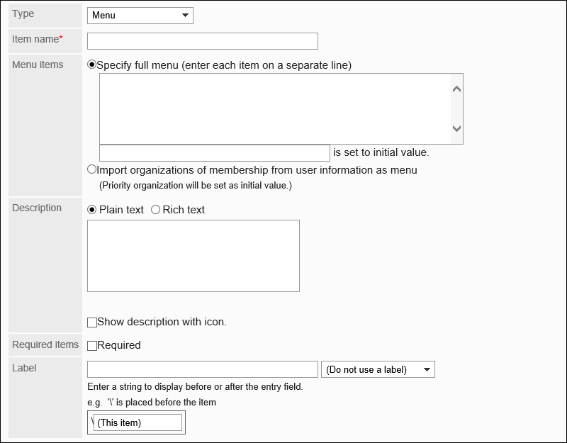
| Item | Description |
|---|---|
| Item name | Enter an item name. |
| Menu item | For a menu item, you can set one of the following:
|
| Description | Enter a description of the item. You can use Rich Text Formatting. To display the description on a separate screen, select the "show description with icon" checkbox.
|
| Required Field | Set whether to make the field mandatory. |
| Characters before or after the input field | Added text can be displayed before or after the input field. Enter a string to set the position to display. |
Radio Button
Radio buttons are items that display strings as choices in radio button format.

The setting fields are as follows:
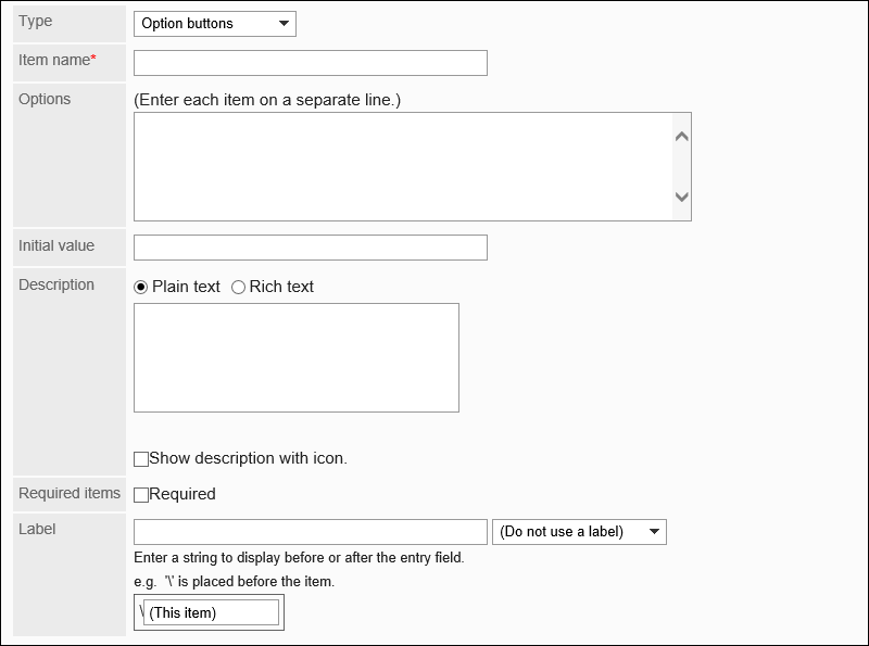
| Item | Description |
|---|---|
| Item name | Enter an item name. |
| Radio item | Enter one item per line. |
| Default value: | You can set a pre-selected menu. |
| Description | Enter a description of the item. You can use Rich Text Formatting. To display the description on a separate screen, select the "show description with icon" checkbox.
|
| Required Field | Set whether to make the field mandatory. |
| Characters before or after the input field | Added text can be displayed before or after the input field. Enter a string to set the position to display. |
Checkbox
Checkboxes are items that display item names to set as selections in checkbox format.

The setting fields are as follows:
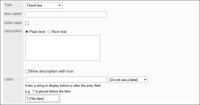
| Item | Description |
|---|---|
| Item name | Enter an item name. |
| Default value: | When you select "Default value", the checkbox on the user screen appears selected. |
| Description | Enter a description of the item. You can use Rich Text Formatting. To display the description on a separate screen, select the "show description with icon" checkbox.
|
| Characters before or after the input field | Added text can be displayed before or after the input field. Enter a string to set the position to display. |
Number
Numbers are items to enter numbers.

The setting fields are as follows:
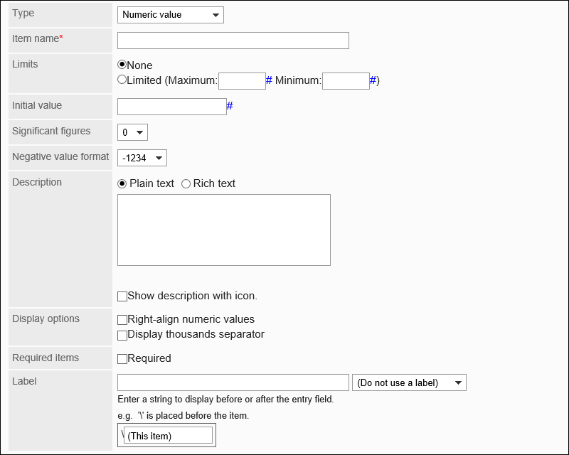
| Item | Description |
|---|---|
| Item name | Enter an item name. |
| Limitation on input | If you set limitations to inputs, select "Limited" and set the maximum value and the minimum value. |
| Default value: | You can preset a number to be displayed. |
| Number of decimal places | You can specify decimal digits allowed from 0 to 10 digits. |
| The way to show negative numbers | Select the way to show negative numbers from the following:
|
| Description | Enter a description of the item. You can use Rich Text Formatting. To display the description on a separate screen, select the "show description with icon" checkbox.
|
| Format | You can select the following display methods:
|
| Required Field | Set whether to make the field mandatory. |
| Characters before or after the input field | Added text can be displayed before or after the input field. Enter a string to set the position to display. |
Date
Dates are items to specify dates in date calendars.

The setting fields are as follows:
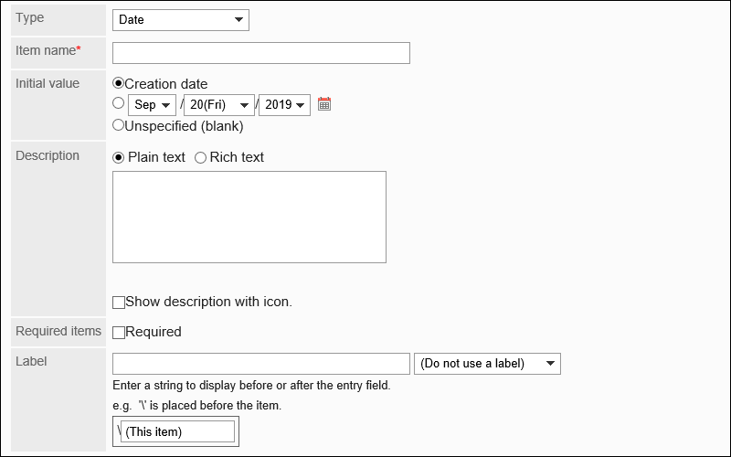
| Item | Description |
|---|---|
| Item name | Enter an item name. |
| Default value: | Set one of the following as a default value:
|
| Description | Enter a description of the item. You can use Rich Text Formatting. To display the description on a separate screen, select the "show description with icon" checkbox. |
| Required Field | Set whether to make the field mandatory. |
| Characters before or after the input field | Added text can be displayed before or after the input field. Enter a string to set the position to display. |
Time
Time is used to specify a time.

The setting fields are as follows:
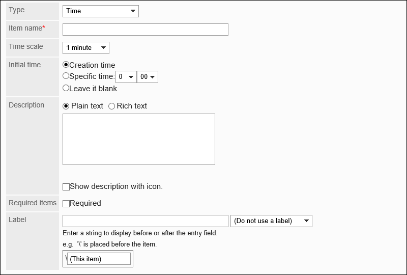
| Item | Description |
|---|---|
| Item name | Enter an item name. |
| Unit of time | Select a unit of time from the following:
|
| Default value: | Set one of the following as a default value:
|
| Description | Enter a description of the item. You can use Rich Text Formatting. To display the description on a separate screen, select the "show description with icon" checkbox. |
| Required Field | Set whether to make the field mandatory. |
| Characters before or after the input field | Added text can be displayed before or after the input field. Enter a string to set the position to display. |
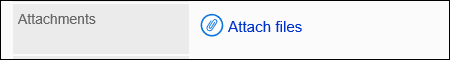
Attachment
Attachments are items to attach files to reports.
The setting fields are as follows:
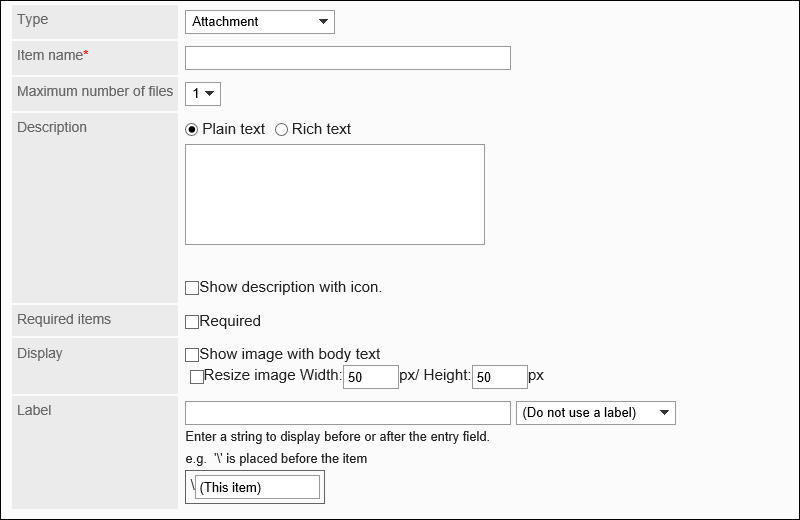
| Item | Description |
|---|---|
| Item name | Enter an item name. |
| Maximum number of files | Set the maximum number of files that can be attached. You can set up to 5. |
| Description | Enter a description of the item. You can use Rich Text Formatting. To display the description on a separate screen, select the "show description with icon" checkbox. |
| Required Field | Set whether to make the field mandatory. |
| Format | If you select the checkbox to show image with body, images are displayed with the body. In Garoon version 5.15.0 and later, if you allow showing thumbnail images, the images will be displayed as thumbnails. However, they will be displayed in their original size on the print screen. If you select the "Resize image" checkbox, the image will be displayed in your specified pixel. |
| Characters before or after the input field | Added text can be displayed before or after the input field. Enter a string to set the position to display. |