Working with Text Formats
This section describes how to use the text format.
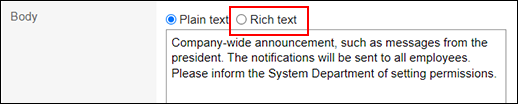
You can use the text formatting feature in the input field of some applications if the system administrator allows you to use it. For example, you can use it for body texts and comment fields in Bulletin Board and Messages.
-
In the input field where you can use the text format, select the item to use text format.
-
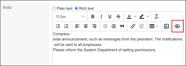
Edit comments and body text using the following text formatting features.
- Apply decoration to text
- Undo or Redo the Action
- Change the layout of texts
- Insert links
- Insert tables
- Insert images
To check how the changed content is displayed, click the Preview icon.
Applying Decoration to Text
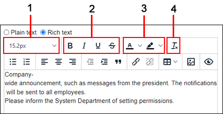
Change the color and size of the text.
| Number | Description |
|---|---|
| 1 | Font size: Change the size of the text. |
| 2 |
|
| 3 |
|
| 4 | Clear formatting: Clear the formatting that you have set. The default format is applied when you clear formatting. |
 :
: :
: :
: :
: :
:
 :
:Undo or Redo the Action
You can undo the action just performed or redo the undone action.
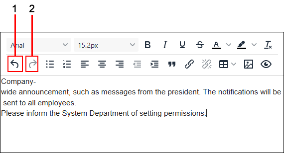
| Number | Description |
|---|---|
| 1 | Undo: Cancel the action just performed. |
| 2 | Redo: Perform the canceled action again. |
Changing the Layout of Texts
Change the layout of texts (Bullet lists and quotes, for example).
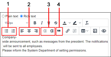
| Number | Description |
|---|---|
| 1 |
|
| 2 |
|
| 3 |
|
| 4 | Blockquote: Specify rows as quotes. 
|
 :
: :
: :
: :
: :
: :
: :
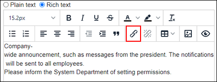
:Inserting Links
Create linked texts and images.
-
Click the insert/edit link icon.
-
On the "Insert/Edit Link" screen, configure the following items.
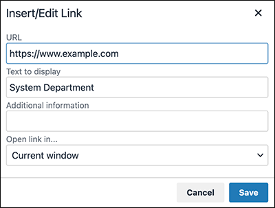
- Target link URL:
You can specify any URL that starts with one of the following:
ed2k:, ftp:, gopher:, http:, https:, irc:, mailto:, news:, nntp:, telnet:, webcal:, xmpp:, callto: - Text to display:
Enter the text to display as a link. If you have already selected a text, it becomes the text to display. - Additional information:
If the selected text is insufficient for describing the link target, enter an additional description.
The added description will appear when hovering the cursor over the link. - Open link in:
Select how to display the linked page.- Current window:
The linked page will be displayed in the same tab. - New window:
The linked page will be displayed in a separate tab.
- Current window:
- Target link URL:
-
Click Save.
Inserting Tables
Create tables. Configure the table details as necessary.
-
Click the Table icon, and hover the cursor over the "Table" shown on the menu.
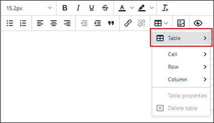
-
Create a table using the menu to configure table cells.
Move the cursor to select the number of columns and rows you want to create and click them.
You can drag to change the table size, column width, and row height of the created table.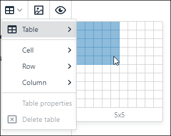
-
If necessary, configure table details using the menus that appear when clicking the created table.
-
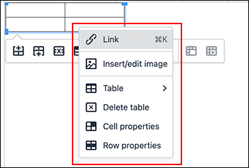
If you left-click the table:
You will see menus to insert/delete columns and rows, and merge/split cells.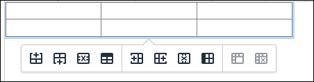
-
If you right-click the table:
The following menus are displayed.- Table
- Delete table
- Cell properties:
For cells, you can configure the background color and border, and specify the width and height in numbers. For details, refer to Cell Properties. - Row properties:
For rows, you can configure the background color and border, and specify the height in numbers. For details, refer to Row Properties.
-
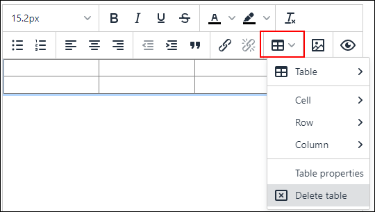
If you click the Table icon on the toolbar:
The following menus are displayed.- Table
- Cell
- Row
- Column
- Table properties:
For tables, you can configure the background color and border, and specify the width and height in numbers. For details, refer to Table Properties. - Delete table
-
Table Properties
This section describes the fields you can configure in "Table Properties".
Use "General" tab to change the width and height of the table. You can configure the table border color and background color in the "Advanced" tab.
The following options are available:
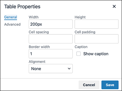
- Width:
Change the table width.
When you input the value only in numbers, the pixel (px) is used as a unit of measurement for configuration.
You can configure the width in a ratio relative to the screen width by adding a percent sign (%) after the numeric value. - Height:
Specify the table height using the numeric value. - Cell spacing:
This feature is currently unavailable. - Cell padding:
Specify the cell padding using the numeric value. - Border width:
Specify the outer border width of the table using the numeric value. - Alignment:
Select the horizontal position of the table (left, center, or right) within the body text or in the comment field. - Caption:
Configure the caption.
Select the "Show caption" checkbox and click Save. Hover the cursor over the "Caption" displayed on the top of the table and change it to any text you like.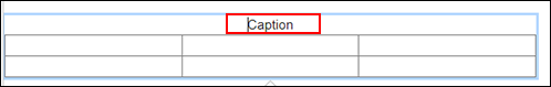
The following options are available:
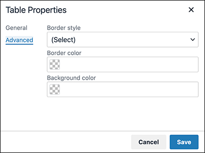
- Border style:
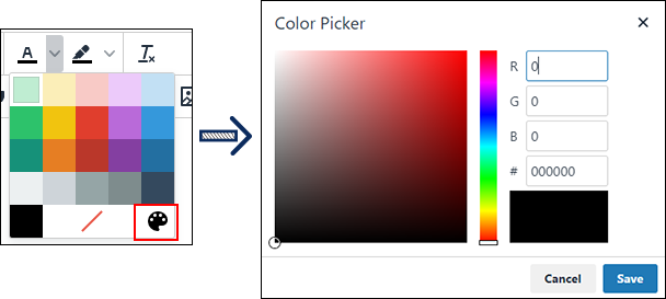
Select the type of outer border of the table. - Border color:
Select the color of border of the table.
You can either enter a color code or select a color from the menu that is displayed when you click icon. Click the
 icon on the menu to display a color picker.
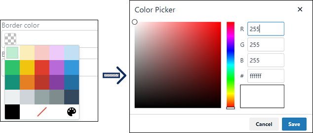
- Background color:
Configure the background color of the table.
You can either enter a color code or select a background color for a table from the menu that is displayed when you click
icon. Click the
icon on the menu to display a color picker.
Row Properties
This section describes the fields you can configure in "Row Properties".
Use "General" tab to change the height and alignment of the row. Use "Advanced" tab to configure the border style and background color for the row.
The following options are available:
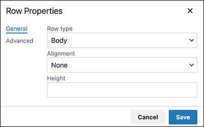
- Row type:
Change the row type to a header or a footer. - Alignment:
Configure the alignment of a text in the row. - Height:
Configure the height of the row.
Entering only the numeric value will specify the size in pixels (px).
If you have configured the table height in Table Properties, you can configure the row height in a ratio relative to the table height by adding a percent sign (%) after the numeric value.
The following options are available:
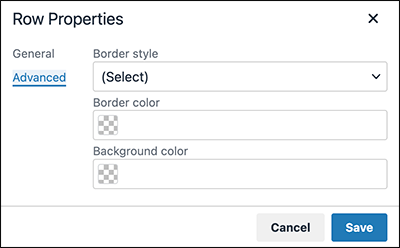
- Border style:
Select the type of outer border of the row. - Border color:
Select the color of border of the row.
You can either enter a color code or select a color from the menu that is displayed when you click
icon. Click the
icon on the menu to display a color picker. - Background color:
Configure the background color of the row.
You can either enter a color code or select a color from the menu that is displayed when you click
icon. Click the
icon on the menu to display a color picker.
Cell Properties
This section describes the fields you can configure in "Cell Properties".
Use "General" tab to change the width and height of the cell. Use "Advanced" tab to configure the border style and background color for the cell.
The following options are available:
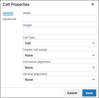
- Width:
Configure the width of the selected column. Select the entire column (not the cell) before making any configuration.
You can configure the column width in a ratio relative to the entire table by adding a percent sign (%) after the numeric value.
Entering only the numeric value will specify the size in pixels (px). If you configure the width in pixels, make sure that the table width in Table Properties matches the total width of the columns. - Height:
Configure the height of the selected row. Select the entire row (not the cell) before making any configuration.
Entering only the numeric value will specify the size in pixels (px).
If you have configured the table height in Table Properties, you can configure the row height in a ratio relative to the table height by adding a percent sign (%) after the numeric value. - Cell type:
Configure whether you want to make the selected cell a header cell. - Header cell scope:
Configure this field if you have selected "Header cell" in the "Cell type" field. You can specify whether the header cell is for a row or a column.
The "Row group" and the "Column group" options do not work at the moment. - Horizontal alignment:
Configure the horizontal position of a text in the cell (left, center, or right). - Vertical alignment:
Configure the vertical position of a text in the cell (top, middle, or bottom).
The following options are available:
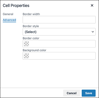
- Border width:
Specify the border width of the cell using the numeric value. - Border style:
Select the style of border of the cell. - Border color:
Select the color of border of the cell.
You can either enter a color code or select a color from the menu that is displayed when you click
icon. Click the
icon on the menu to display a color picker. - Background color:
Configure the background color of the cell.
You can either enter a color code or select a color from the menu that is displayed when you click
icon. Click the
icon on the menu to display a color picker.
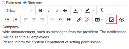
Inserting Images
You can insert images into the following input fields:
- Body text and comments of topics
- HTML portlets you configure in the system administration screen
-
Click the insert/edit image icon.
-
On the "General" tab of the "Insert/Edit Image" screen, configure the following items.
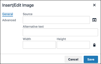
- Source:
Click the "Source" icon to select the image you want to insert. Files with ".gif", ".jpeg", ".png", and ".bmp" extensions can be inserted.
There is an upper limit for the size of a file you can insert. The upper limit varies depending on the setting configured by the system administrator. For details on the settings, refer to Setting File Size Limitations in Administrator Help. - Alternative text:
Enter a description of the image. If the image does not appear for some reason, this content will be displayed instead. - Width:
Change the width of the image.
Entering only the numeric value will specify the size in pixels (px).
You can specify the width in a ratio relative to the screen width by adding a percent sign (%) after the numeric value.
The width changes with keeping the height/width proportion of the image. If you do not want to keep the height/width proportion, click the icon to unlock the key.
 - Height:
Specify the image height using the numeric value.
The height changes with keeping the height/width proportion of the image. If you do not want to keep the height/width proportion, click the
icon to unlock the key.
- Source:
-
Configure items in the "Advanced" tab as necessary.
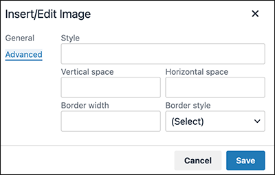
- Vertical space:
Specify the top and bottom spaces of the image using the numeric value. - Horizontal space:
Specify the right and left spaces of the image using the numeric value. - Border width:
If you select a border style, specify the border width using the numeric value. - Border style:
Select the style of border.
- Vertical space:
-
Click Save.